Showing posts with label Analyses. Show all posts

Wednesday, 18 April 2012

Justin Quinnell Analysis


Justin Quinnell

On Quinnell’s website he has a list of his interests, these include: photography, art, music, travel, bird watching and his family. All of these interests could and probably have influenced his work. He is currently a photographer, teacher and lecturer. He has been at many universities (in England, America and Australia), and has made TV and radio appearances.


Breakfast
(Photograph)

Because of Quinnell’s interest in his family it makes sense to have photos that reflect and are stereotypically childlike (bowl of child aimed cereal and a toy monster).
The photo is part of a collection by Quinnell- colour pinhole photography collection. (Doesn’t appear to be created for any exhibition, commission, show, or articles etc.). The subject is of a rather modern idea and therefore suggests that it is recently produced.

The composition of the subject appears to be controlled/designed but the surrounding elements are randomly arranged (the cheerios lay where they fell). The pieces in the piece are all related; the spoon, cheerios and the bowl are obvious, breakfast, but the monster is a little more obscure. The recent set of TV adverts for cheerios includes a ‘family’ of monsters craving the cereal; the subject monster may appear out-of-place but isn’t really.
A pinhole camera was used to capture this image; the artists has revealed his love of his family and as the subject is stereotypically of a child’s cereal; the cereal also creates an nice texture.

The works title is ‘Breakfast.’
I believe that it does affect the way you perceive it; without the title you see a bowl of cheerios, a spoon and a green monster appearing from within. But with the title you can imagine a child eating his/her breakfast and a monster emerged from within to scare the child or crying for help because it was drowning in the milk and cereal.

Tuesday, 17 April 2012

Geraldine Georges Analysis


Geraldine Georges


Georges is a Belgian illustrator designer, most of her work is an abstract female form, has had commissions from several companies including L'OrĂ©al, Schweppes and has featured in the New York Times.
                   

Georges is the artist responsible for this piece, it is a form of collage where she draws lines and shapes and adds images that she has collected to the piece to give it its character and subject. It is definitely a unique form of art to Georges, her work is a combination of photography, graphics and illustrations. 
The image (left) is called 'The Kiss' and is a piece created by Geraldine Georges. It is a beautiful piece and definitely fits within modern ideas of art.

I believe that the size of this piece is irrelevant as the beauty and simpleness of the piece means that it could be displayed in a myriad of ways and the effect would be the same. I imagine that this image would quite easily be produced and sold has other items than a print; such as postcards, decorative print cushions and/or fabric print bags. There is definitely a sense of an illusion, as the subjects are positioned over each other and are leaning in from the same direction; while the overlaying of the couple emphases an embrace.
Georges has used pastel colours, which forwards the image view as understated and relaxed. The soft shade of pink furthers the gesture of love that generally comes with a kiss.  The development of the image includes adding a collage of photos and fastening them to a background overlaying one on top of the other. After Georges draws smaller details that highlight tones and emotions evoked from the final piece. 

Personally I love the piece as it invokes many emotions and your imagination is allowed to run free; also the uncluttered arrangement of the subject allows for the simple design to become elaborate and sophisticated. Again I am reminded of images and patterns that have recently appeared as prints on fabric bags, cushions, album artwork and cards.
The first words that came into my head were: kiss, embrace, love and simplicity; all words attended to within the image. At first I was drawn to the main subject the culmination of the kiss, after you take notice of the pastel coloured shapes, especially the soft pink imperfect heart. 

The title of the piece confirms what you see in the image - a kiss. The title of the piece is a definite theme but so is Georges recurring theme of female form- the woman is the largest element; it could also be argued that the feelings portrayed in the piece are themes present. 


More of Georges' work can be found here: http://www.geraldinegeorges.be/work.php?id=73

Tuesday, 20 March 2012

Rankin 'Destroy' Analysis


This piece was created by Example for Rankin’s ‘Destroy’ project.


The creators of this piece are Example and Rankin; the photo was ‘destroyed’ by Example inspired by his marketing department and Rankin’s collection. You can definitely get a sense of the person that is the artist; knowing his background and having read the accompanying quote allows new comprehension of the piece. The image is part of a collect but is unique to itself, as the ‘destroyer’ and piece has his own inspiration. The piece was produced in 2009 and without prior knowledge I would have guessed it was a creation of the 21st century because of the subject and the theme in the print.

The image is a 20x24'' piece I don’t think this makes a difference in how it is perceived as that is in the ‘alterations’ made to the subject. The photographer shot the piece in black and white while the ‘destroyer’ made use of colour- red. This adds a huge contrast between the subject and what the artist has done to create the final piece. The exaggeration is obvious because of the bold choice in colour and how different it is from the grey scale subject.
The final product was created by capturing and developing a black and white photo; after a red felt pen was utilised to draw hair, beard and text onto the developed image. If alternative materials were used in the development of this image the effect would be different, the tip of the pen give the detail where paint and pastels would give less defined results drawing away the cartoon realistic hair. The pen also could further the impression of someone doodling aimlessly.

The piece reminds me of drawing moustaches, glasses and beards on faces in newspaper and magazines looking for a way to make the image more entertaining. The quote adds a personal opinion, and almost making fun of the unsuspecting victim of a child’s boredom. There are also images exhibited in the Tate Modern that have a very similar attribute with the text written on the photo.
I like this piece as it is simple yet evocative. When I first saw the photo is recognised the subject as Example and immediately saw a connection between the subject and the alterations made; the text on the image reminded me of song lyrics and seeing as Example is an artist assumed that it was from one of his songs. Reading the quote about the context of the image from Example allowed me to understand that it wasn’t what it original seemed; just like the appearance of the musician can change but the music will stay the same, it is just the manor in which it is viewed. 

Thursday, 5 January 2012

Patrick Rochon


Patrick Rochon


While in complete darkness the shutter is opened and lights sources projected onto and around the subjected; the light produced is moved around to create interesting patterns. Light sources used are laser pens, flashlights and anything else that emits light. A single take can be exposed for varying times of 1 second to 30 minutes.


This image was created by Patrick Rochon and comes from Light Painting Manifesto. Patrick Rochon is a photographer that uses light painting and similar effects to created his pieces, some of which have been commissioned and film pieces for TV commercials. It fits in with the theme of current period works; an abstract image that allows you to decide what you see. For instance I see a flower or a pinecone in an illuminated blood red. I don't think that the scale of the piece is relevant as the audience will still have the sense of the image; saying that, if the image was 24" x 36" (or larger) the lone subject would have a greater affect. Again I believe that the image would only a house/gallery if it was in a contemporary building.
The use of red light causes the image to stand out against the black background; red is the colour of fire and blood and is commonly associated with energy, danger, anger, strength, power, war, determination and also passion, desire and love; the photo definitely envisions some of these attributes.


Personally I love the photo; Rochon has obviously worked and planned how to produce this image to give it the shape that it beholds. Again this image reminds me of a pine cone or an exotic flower. The preparation Rochon put in obviously paid off as the image does hold certain qualities, such as the sense of three dimensions. 

Pablo Picasso Analysis


Pablo Picasso is the artist that created this piece. He is a famous Spanish painter, who is a well known co-founder in the Cubist movement in the early 1900’s. Before he started painting with his light pen Picasso was creating images with a paintbrush and oil paints; producing works like these:


Picasso is an interesting person to analyse as he has proven himself in many areas of art, painting, sculpturing and photography, to name a few. Along side his other work you can see the diversity and breadth of his range of skill.
Most creations belonging to Picasso are hanging in museums or private collections around the world.
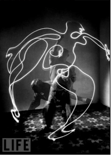
The image is a photograph taken around 1949. The image was part of a collection of images that Picasso created; Picasso Draws a Centaur is the most famous of the group of light paintings. There were many artists working in this style at this time, such as Man Ray, Frank Gilbreth and Gjon Mili, who introduced Picasso to the art form.

In the image you are given a sense of movement, as Picasso has been captured in several positions as he is ‘painting.’ Unlike other forms of photography and paintings in this image you can see what has happened to produce the image produced; rather than a series of images leading to the final outcome, this one picture has captured it all.
The photo is in black and white. The image drawn has no straight lines and few sharp corners; the lines are curved and are produced in one fluid motion, therefore the impression given of motion and life. The transparency of Picasso himself also gives the photo life and motion.

Picasso would have had to prepare and plan a certain movement path so that the rough outline of the person is visible and interpretable; he would also have to work out how long he had as a result of the delay of the shutter opening and closing is, to ensure that he has drawn the image in that period given.


This piece reminds me of my dad’s drawings, the irregular proportions of the body and the freedom of the pen with fluid motions. The fact that there is an irregular shape to the subject gives it a sense of freedom and reading deeper into you could interpret free will of the person unrestricted by the usual image, free to make their own decisions- Picasso was unrestrained in drawing the person this way. The image is unique as is every person.

Personally I like this piece by Picasso, though it is not my favourite light painting; some are more elaborate and intricate, but Picasso did not have the technology that these images have. I enjoy the fact that you can see him drawing the painting, and that he is blurred and also that due to the slow shutter speed, it makes several versions of him appear - I think that this is quite effective, and allows you to guess and understand the process in which the image was produced. Because the slow shutter speed allowed Picasso to be capture in movement and is partially translucent it adds a ‘ghostly’ feel and gives the image an intriguing atmosphere and impression- the image gains life.


This photograph fits into the category of Portraiture as well as Abstract, as the artist is best known for his Abstract paintings and work in general. Picasso’s work has always struck me as impressionistic and the audience can decide on what they see- the base of the image may be the same (e.g. a person) but the way on which the subject is perceived will be different- is it about freewill and freedom or about overcoming discrimination about the way and who you are. Picasso’s work is can look like more than one thing, depending on their age, gender or even at what point in time that they look at it people will interpret different things.


What do you think the artist is trying to say or represent?         Again I think that this is open to interpretation; Picasso could simply be experimenting with a new form of art in which he was introduced to by a fellow artist and was intrigued to try it and or expand his repertoire; or something else entirely
What do you think the artist is trying to say or represent?